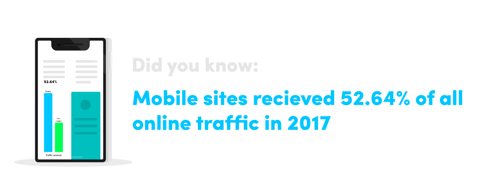
Mobile phones are essential to our everyday lives now, but we use them for so much more than just making calls. Hand-held devices now have a much wider scope for potential uses, whether we’re playing games, capturing images, checking email or browsing the internet, and much more. This is beneficial to businesses because it provides another way to increase web leads and boost traffic. In fact, it’s no surprise given the way we live our lives that internet usage is now more popular on a mobile device than a desktop.
What are the benefits of mobile optimisation?
Mobile optimisation is critical for any business website, as a poor user experience can make or break your relationship with potential customers. Businesses often forget that the person viewing their site on a mobile is mobile, therefore their experience is completely different from what they’d have on a normal website. The information they want to be able to access quickly may not be as visible on a mobile view as it is on the desktop, and this can cause issues for the user. For example, a mobile visitor is likely to be looking for your contact details or a map to your office location, but they won’t be reading staff bios and PDFs. Google considers mobile optimisation as one of their many ranking factors. When considering the development of your site, it’s also important to understand the nuances of web app vs website, especially in the context of mobile optimization.
User Experience
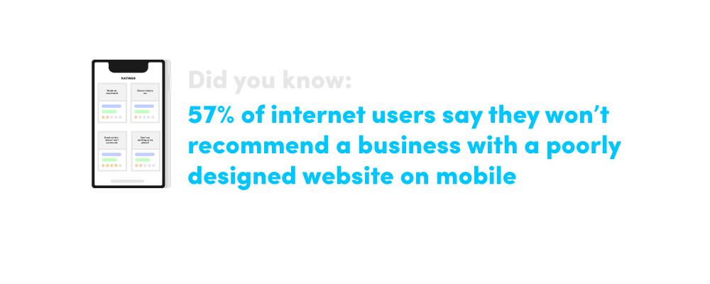
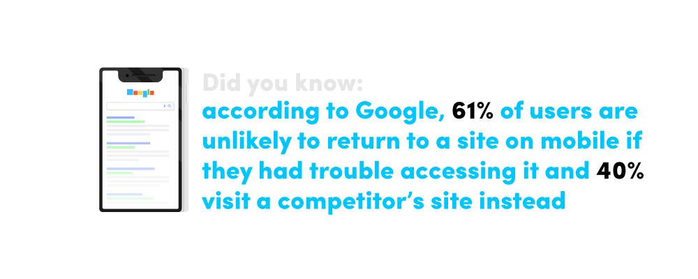
This leads on to the first benefit of optimising your site for mobile is creating a good user experience. When you’re browsing a site that’s not optimised for a portable device, it can often feel disorganised and difficult to navigate. This poor experience can lead to visitors dropping off your site in search of a better experience elsewhere.
Optimising your site not only helps you retain the visitors who come to you but also leaves them with a good impression and a higher chance of customer satisfaction. The best way to achieve this is by simplifying your mobile site by only displaying the key bits of information and keep the steps involved from the entry point to purchase as streamlined as possible.
Don’t use Flash that can be aggravating on a mobile device or, even worse, not work on the user’s phone which can lead to a higher bounce rate. Apple products don’t support Flash and they make up around 30% of the smartphone market, so by using Flash, you’re instantly alienating a third of your audience. And make sure that when users are navigating between tabs, you make it easy for them to find their way back to the original page. All these elements can really affect your conversion rates.
Competition
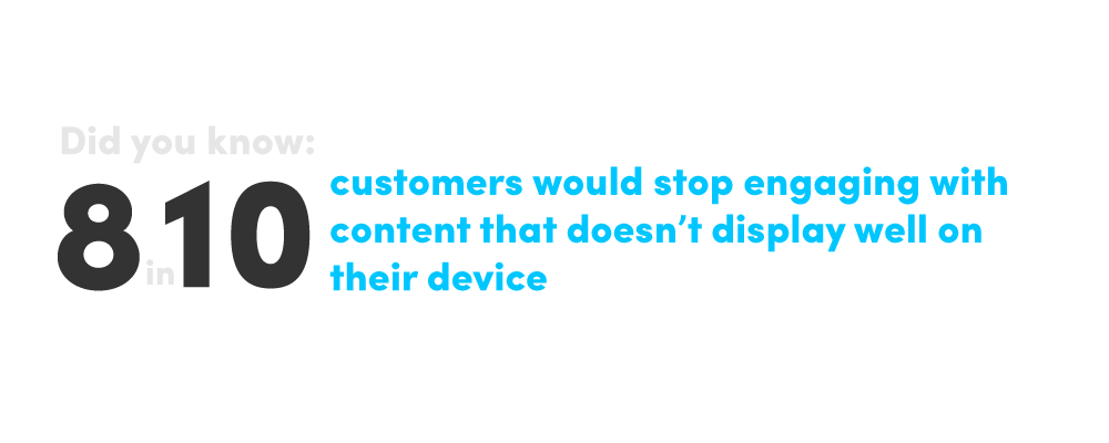
The field of internet marketing is a competitive place, so standing out for the right reasons is key to success. Consumers are always going to opt for the better optimised, more positive user experience over those which are not, so optimising your site for the best possible consumer journey helps you to grab, and more importantly maintain, your customer’s attention over your competitors. When planning your mobile layout, remember that you’re working with less screen space so it’s important to be concise and show off the best your brand has to offer when creating titles, URLs and meta descriptions for showing up in SERPs.
Offline Integration
Using QR codes or progressive web apps can help you to integrate with offline media and can serve as a means of offline advertising. QR codes can be scanned and translated into information such as email addresses or URLs, which will help you direct traffic to your site and lets you communicate with offline users all over the world. Progressive web apps or PWAs are a blend of a website and an app, but they don’t need to be installed and are quick to load. PWAs fit any device, so they’re great for mobile, and are linkable so you can easily share the application via a URL without the need for complex installation. Developing and promoting a native app can be difficult for smaller companies with little brand recognition, so PWAs are a great way to gain more exposure and increase conversions.
Branding
Providing a customer with a bad experience on your site can lead to a bad impression of your business, especially if it’s their first interaction with your brand. Conversely, offering a great experience means they will bear you in mind in the future. It’s important to incorporate the same branding elements as you have on your main site to develop consistency and help to establish trust with your audience.
Portability
Because mobiles are portable, you can essentially be accessible to your customers at any moment, anywhere in the world. It’s important to use this to your advantage when optimising your site and making it easy to use and access whenever they need to. Make sure you put redirects in place which will identify when a user is navigating on a mobile device and direct them to the mobile optimised version of the site. Mobiles are more prone to connectivity issues, so page speed is also important – to counteract this, look at optimising images, minimising unnecessary code, leveraging browser caching and reducing the number of redirects they have to contend with to help speed up the site.
What are the key features to look out for?
When carrying out a health check of your mobile site, ask yourself the following questions when navigating:
☑️ Does it load in less than three seconds?
☑️ Are the key selling points and calls to action clearly marked?
☑️ Is the content easy to read and can you navigate easily to other sections of the site?
☑️ Would you spend time on the site if it was not your own?
☑️ Do you feel you’ve been provided with a good user experience?
These questions will help you to determine where the pain points are of your mobile site and will give you starting points for creating a better-optimised layout to help encourage more visitors and conversions.