Wanna know where your users are pointing all of their attention throughout your pages? Heatmaps could be your answer. In this article, we’re gonna point out the top reasons you should be using heatmaps to delve deeper into understanding the behaviour of your site’s visitors. First things first – let’s look at:
What exactly is a heatmap?
Heatmaps are visual displays of your site’s data. They were first drawn up in the mid-90s and are now sharply becoming one of the most popular ways to analyse user behaviour. They show us how to improve layouts, content, and refine conversion rates. In a nutshell – the technology tracks how users control their mouse, qualifies this data, and shows it to you via a map that looks like thermal vision. The more a space glows, the more attention it’s getting. I know, crazy right?
The maps can be used to track mouse movements, scrolls and click areas. The larger your sample size, the better the map actually represents trends within your user-base. So, now that you know what heatmaps are, let’s go over some of the best reasons to use them in developing your online assets.
1. Speed
Reading text and numbers takes time. You can find a whole swarm of metric analysis on Google analytics, but how long will it take you to collect the data that tells you what you really want to know? Ages in most cases. Heatmaps are far more simple and because they’re so spectacularly visual, it takes seconds to look at one and work out where your page needs work. 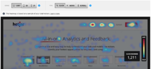
Here is your perfect example of a heatmap, courtesy of Hotjar – Who allow you to analyse your web and mobile visitors through heatmaps, recordings, conversion funnels and feedback polls.
2. Learn what calls-to-actions actually work
With a Click heatmap, you can identify the spots on your pages where users are actually clicking. Have a call to action that’s being ignored? With a Heat Map, you’ll see why. You might have text or elements ridden throughout your pages that users are trying to click, only to find there’s no link. Place your links in the right positions and you’ll instantly gain an improvement in your clicks to your desired destination. Here you can read the perfect guide to improve your call-to-action and conversion rates. Interestingly, there’s always usually certain parts of your site that receives more attention. Without a heatmap, you’ll have no way of knowing where these areas might be. So you need to capitalise on this and put the vital information where people are looking. If you had the chance to increase your click-through rates on key call-to-action links by as much as 50%, wouldn’t you be jumping at the chance to do so?
3. Master content and usability
Research shows that the quality of content above “the fold” plays a huge role in determining whether or not visitors continue to scroll down on your pages. “The fold” refers to the point on the first page that requires a scroll to move further down exposing more content. If everyone’s focusing all their attention on just the very top of your pages, it doesn’t make sense for all your call-to-actions and most valuable links to be at the bottom several scrolls down, unless your initial content is compelling enough to make them do so. 
Here is the perfect example of an above the fold landing page with a form, product image and trusted logo design. If your site’s maps show a drop in scrolls at certain points, it means you might need to rethink your design and usability. If the first page is the only content being viewed, maybe a more conventional single landscape page with all the vital information provided upfront is the more effective and profitable way to go. Of course, there’s no way to tell if this is the case for your site without the help of a scroll map. If your users are scrolling, how far down the page are they getting on average? At what point do they lose interest? With this kind of insight, you’ll be able to work out which sections of your content are performing, and where the ball is getting dropped. Instead of starting from scratch to recreate entire page content, with a map, you’ll be able to see which pieces of the puzzle are worth keeping and which pieces need to be reworked. 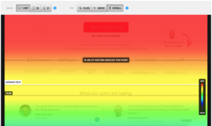
4. Locate elements that are totally ignored
No site wants to be pulling along dead weight. A heatmap will show you spots and elements on the page that aren’t seeing any action whatsoever. These components are the difference between a site that performs with average results and one that is streamlined to offer nothing but 100% pure hot stuff. If there’s a component that doesn’t contribute to the usability of the site or your conversion rates, it’s time to go.
5. Place images where users want them
Images can make or break your funnels and positioning is crucial in determining whether or not these additions bring value. With an eye tracking heatmap, you can identify how your images are impacting the journey your users are talking through your pages. You might think you’re using images that strike the perfect balance between beauty and direction, but there’s no way you can be sure without heatmaps insight. What if your hugely impressive images are actually distracting users from other key elements? Something as simple as changing the style of an image so that it’s less complicated, or replacing a forward facing character with one that is side facing can make a significant difference. Heatmaps give you the means to measure and compare these features until you find the optimum design.
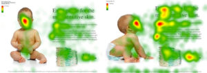
This shows you the perfect example of how an image can completely change the action of a user.
6. Decreasing checkout fails
Running an ecommerce store? Then understanding how your visitors interact with your checkout system is going to be a major concern. You might be getting piles of users to your sales pages and even having a great percentage of them add items to the cart, but what if the position of vital buttons is putting them off in the final stages? The North Face had this exact issue and used heatmaps to identify the problem precisely. They were getting major traffic but were seeing major abandonment levels throughout their checkout stages. The map showed that their checkout buttons weren’t positioned where users were looking most. By pushing the buttons higher on the page where they could see users were placing most of their attention, The North Face were able to achieve a 21% boost in clicks through to their final shopping cart page. That’s it! These are some of the best reasons you should be taking advantage of heatmaps to analyse your websites users. We hope you’ve found this quick overview helpful! Have more tips that you think we’ve missed? Feel free to share them with us in the comments below!